
Moving into a mobile-first search landscape.
Since last year, Google has been discussing their transition to a mobile-first index for search. This means they will create and rank search results from a mobile point of view instead of the traditional desktop view. Google will show search results to a user based on the content that lives on your mobile site. Even if online users are on a desktop they will still see the mobile indexed results.
This looming update has many search engine practitioners, digital marketers and developers thinking about how search and user experience is reflected onto smaller screens.
Google’s Shift to a Mobile-First Index
Really, it is no surprise that Google is making the shift. They are simply reflecting the needs of users. A recent study shows that 55 percent of traffic is coming from mobile devices, which will only continue to grow. If the majority of users are interacting with the web on their phones then it only makes sense to prioritize mobile content for those users.
This doesn’t mean that the desktop experience is obsolete. Google will still crawl and index the desktop version of your website if a mobile version doesn’t exist.
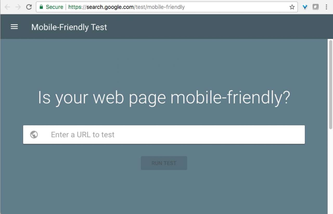
The Mobile-Friendly Test
Not sure if your current website is mobile-friendly? Google has created the Mobile-Friendly Test. It’s an easy tool for anyone to see how a visitor uses your website on a mobile device.
If you are familiar with Search Console tools, you can also use the robots.txt testing tool to verify that Google can crawl your mobile site.
Most importantly, view your site on your own mobile device. How do you interact with the website? Can you easily navigate its pages? Is the content scaled to your specific screen resolution? These are some things to take into consideration when moving to a mobile website or making site improvements in general.
If You Don’t Have a Mobile Site
There is no need to panic if you don’t have a mobile version of your website. Google will still crawl and rank the desktop version of your site if a mobile website does not exist. If you have a desktop site that is responsive you shouldn’t need to change anything, meaning the content on the site dynamically changes depending on if you are using a desktop or mobile device. However, if neither applies, this would be a good time to talk to your web development team about prioritizing the implementation of a responsive website.
Optimizing a Mobile Site
Streamline Your Content. Review the content on both your desktop and mobile websites to ensure that your primary content exists on both versions. For example, if the mobile version of your site has significantly less content than the desktop version, the mobile version will now be treated as the primary version, which could have a significant impact on search impressions and ranks. If you do not have two separate versions and your website is responsive, you don’t need to worry about primary content.
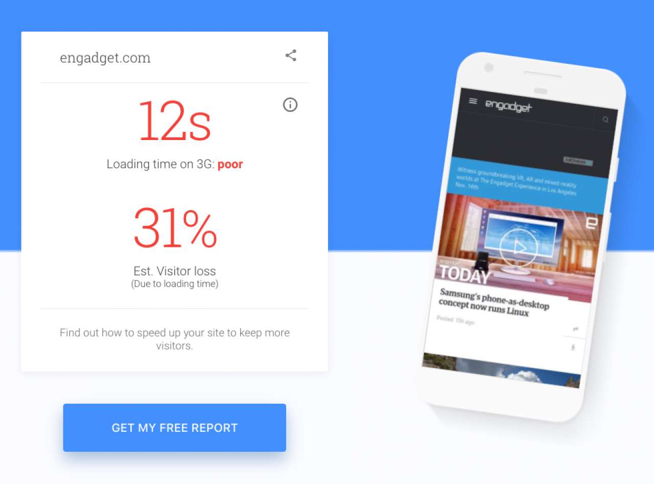
Improve Page Speed. Users expect websites to load quickly as does Google. It is important that you ensure your website loads quickly to reduce bounce rate and maintain local rankings. If you are not sure how efficiently your site is loading, use Google’s Mobile Speed Test. This test will show your website's page speed and offer tips for improvement
Remove Intrusive Interstitials. Does your website use popups to capture email addresses or advertise current promotions? Earlier this year, Google started to crack down on the use of popups that block site content or interfere with user interaction. Google has begun to devalue websites and push them down in the search results, but you also run the risk of losing visitors and increasing your bounce rate.
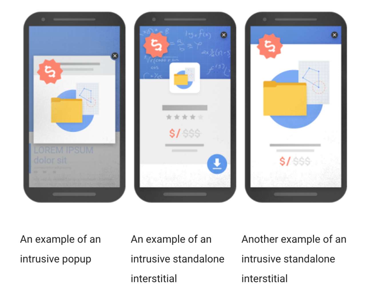
However, Google has released additional guidelines for alternate popup dimensions that marketers can still use for lead generation and promotions. You can view the full mobile interstitial recommendations here.
Optimize Titles and Meta Descriptions
Now that you’re dealing with small screens, you’ll need to optimize your page titles and meta descriptions to fit appropriately. It is best to have keyword rich titles that are concise without sacrificing the quality of the information. Think concisely.
Search Intent is Still King
Remember, this new signal is just one of hundreds of data points used by Google to rank a website. “The intent of the search query is still a very strong signal—so even if a page with high quality content is not mobile-friendly, it could still rank well if it has great, relevant content,” Google announced recently. To succeed in the search results, your top priority should always be to deliver a top-notch user experience and quality content that keeps users engaged and returning to your website.